Data visualization in PathVisio
This tutorials shows you how you can visualize data in PathVisio. Make sure you successfully imported your expression dataset before you start creating a visualization!
- All visualizations are saved in an .xml file in the same directory as the input data file. If you open the dataset later again (Data > Select Expression Data > Select the created .pgex file), all visualization settings are saved and restored.
- You can switch between visualizations in the drop-down box next to the quick menu.
Below we added three examples for visualization in PathVisio
- Simple visualization (log2FC)
- Advanced visualization 1 (log2FC + pvalue)
- Advanced visualization 2 (log2FC from multiple comparions, e.g. time-series, different tissues, different dosages, etc.)
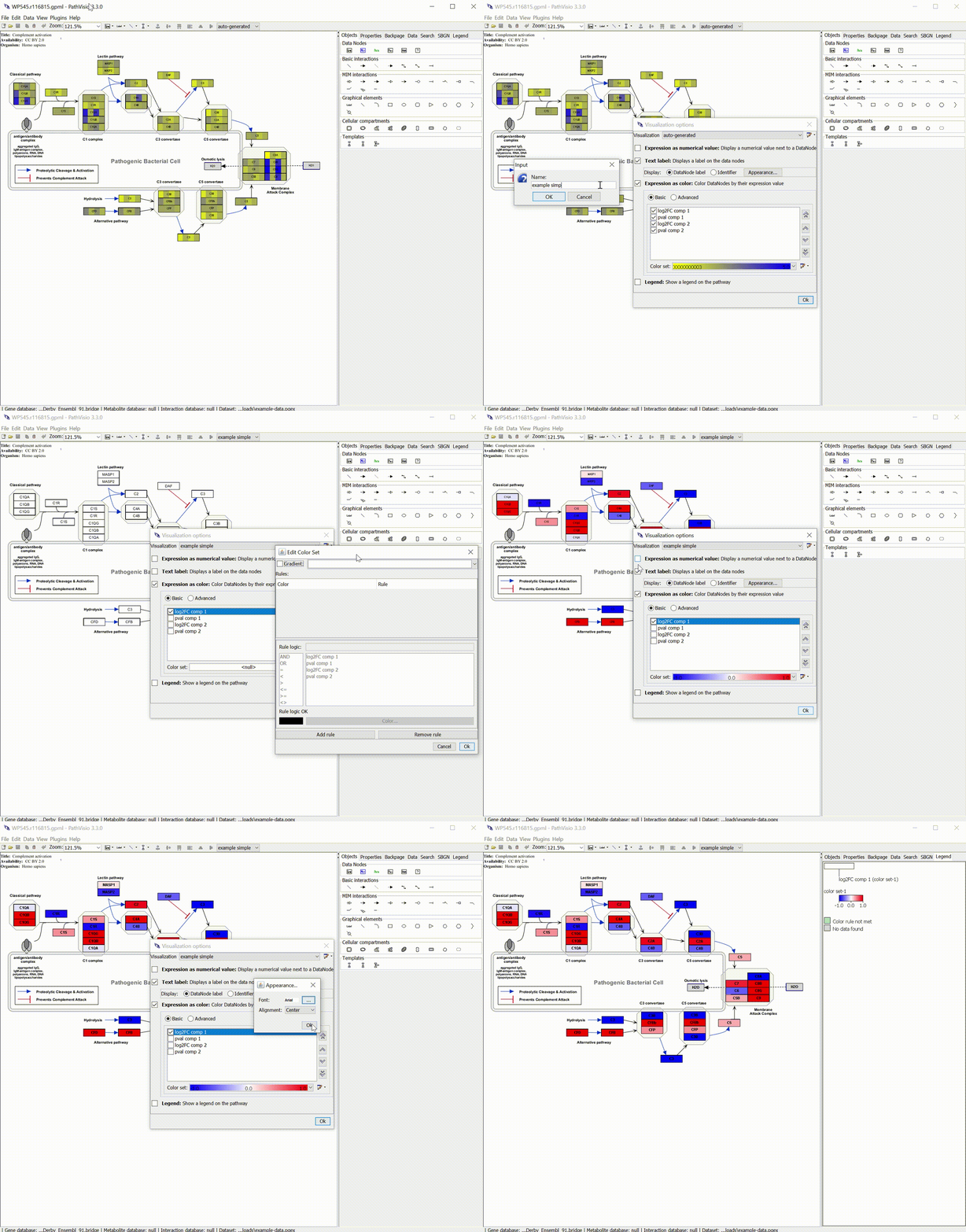
Simple visualization (log2FC)
The following gif shows how you can create a gradient visualization for a log2 fold change:

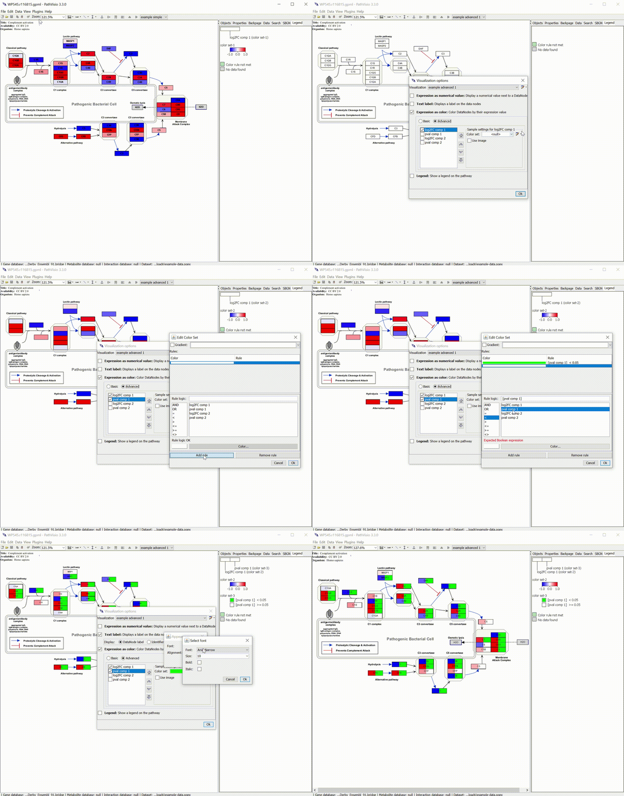
Advanced visualization 1 (log2FC + pvalue)
If you want to visualize the log2FC but also show the p-value, you can combine a gradient visualization (log2FC) with a rule-based visualization (p-value) as shown in the following gif:

Advanced visualization 2 (log2FC from multiple comparions)
If you want to compare the changes from mutliple comparisons next to each other you can use an advanced visualization wiht a gradient visualization for multiple columns as shown in the following gif.

Let us know if you miss any other tutorials or want to share tips with our users: create issue.